Every standout space deserves an equally standout sign. For Sea Island Resort, David G. Flatt Furniture, Ltd brought that principle to life, crafting a custom entrance piece that is bold, elegant, and designed to last.
Here’s how the project came together from start to finish.
Starting with a Vision: Digital Rendering
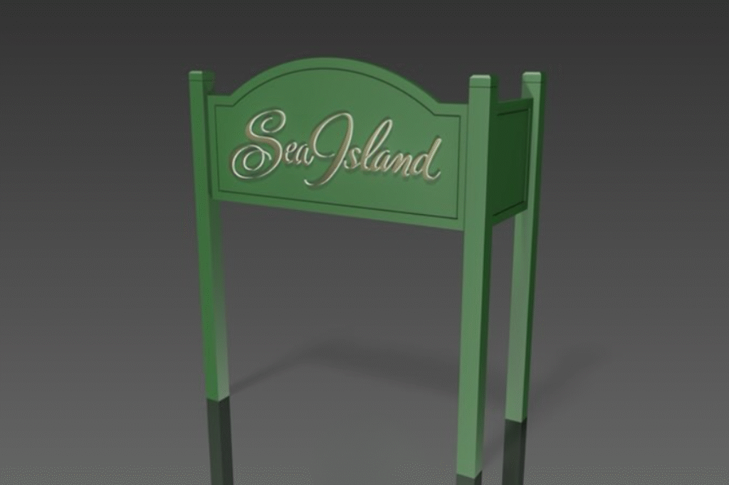
Before the sawdust, there was the screen. The Sea Island sign began with a 3D rendering, providing the client with a true-to-life preview of proportions, lettering, and materials. This first step wasn’t just about approval—it was about precision. With a classic arch-top silhouette and flowing script font, the rendering established the design intent and served as the technical blueprint for all future work.
Precision Matters: CNC Cut Components
With the rendering finalized, the team moved on to fabrication, utilizing CNC cutting, which is ideal for both custom furniture and signage. Each part of the sign, from the main panel to the leg supports, was cut to exact dimensions. CNC allowed us to maintain the delicate curves of the frame while ensuring repeatability across parts. This approach is crucial in both modern design services and event furniture rentals, where consistency is key.
Primer Coat: Smooth and Seamless
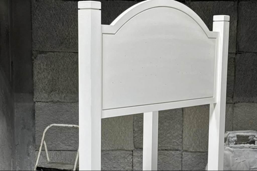
Before color comes primer. The entire structure was coated in a clean white base. This even surface is essential for two reasons: paint adhesion and tone clarity. It neutralizes the material below, ensuring the final color remains accurate and vibrant year after year, even in outdoor conditions. At this stage, we inspect every detail—no texture issues, no hidden imperfections.
Custom Green: Branding Meets Durability
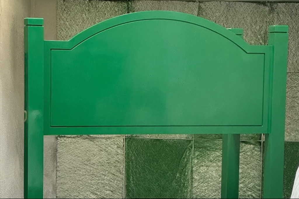
Next came color. The custom-mixed green was formulated to match Sea Island’s brand aesthetic—rich, natural, and inviting. Applied in stages, the paint went on evenly with no drips, blemishes, or tonal inconsistencies. Even the platform base was sprayed to ensure total visual continuity. The result? A finish that looks as good in year five as it does on day one.
Dimensional Details: Metallic Gold Lettering
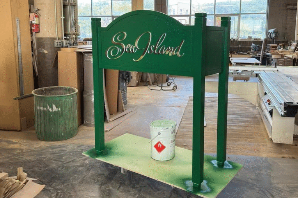
The showstopper is the lettering. The Sea Island name was rendered in metallic gold, inset perfectly into the painted surface. These letters catch and reflect ambient light, giving the sign a luxurious glow. In resort settings where first impressions are everything, these subtle details have a significant impact, transforming a sign into an experience.
Ready to Bring Your Brand to Life?
Whether you’re sourcing space-enhancing signage, building year-round event furniture rentals, or simply finding new ways to stand out, David G. Flatt Furniture, Ltd is ready to help you create something exceptional. Contact us today to get started with your custom fabrication project!