When Falke asked us to conceptualize and engineer an ideal booth for The Running Event (TRE), in Austin, Texas, we knew we had our work cut out. Runners are notoriously hard to pin down — and not just because they’re always on the move. The goal was to create a visually striking and functional space that would showcase Falke’s premium athletic apparel and accessories.
Building an Open Layout
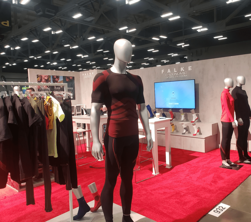
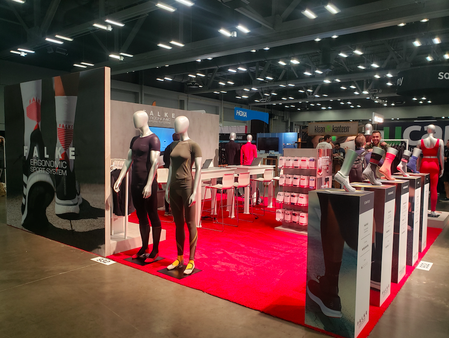
We worked closely with Falke to understand their brand and product offerings, as well as identify key messaging and design elements that would resonate with their target audience. We decided on an open layout design to allow booth visitors to be able to see the products from any angle. This simple layout gave people multiple paths to interact with the items.
Our design also let Falke distinguish its brand from the pack. TRE can get pretty crowded, and the booths often reflect that. We wanted to help Falke evoke the wide-open sense of freedom you get while running. Keeping the displays minimal offered a refreshing feeling of openness.
Attracting Foot Traffic
One of the ways we made Falke’s booth eye-catching was by placing the display plinths around the edges. This helped us attract people’s attention in passing. For instance, the life-sized mannequins popped out at you as you rounded the corner of the rear panel wall — almost as if to say, “Hi, let’s go for a jog!â€
With the footwear displays, we did something similar, but we brought them closer to eye level. Shoes and socks are huge attention-getters at TRE. Our design team made sure you could easily examine Falke’s products without bending down.
Building Out the Environment
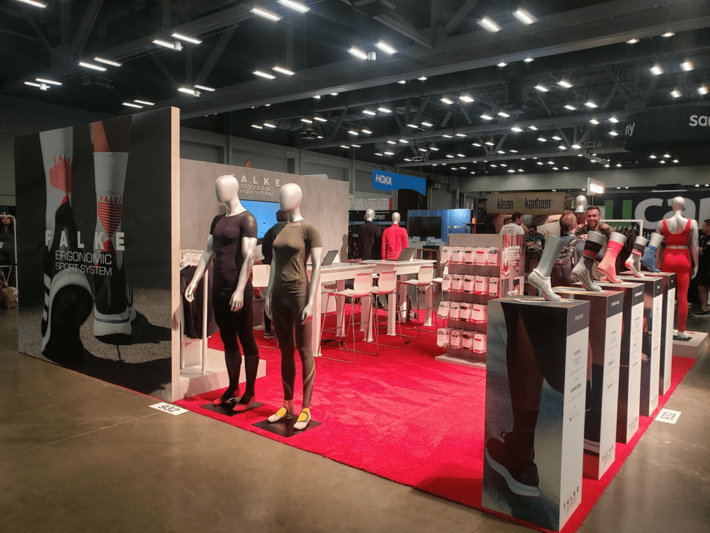
For the rear panel wall of the Falke event booth, we wanted to highlight the products and branding in one go. The stepped shelving at the back accomplished this by giving the eye a natural path to the big screen and logo. We positioned the service counter to keep the branding front of mind — if a visitor wanted to chat with the booth staff, the displays would be in full view all the while.
Compared to some of our other work, this booth was more about functionality than fashion, but we knew aesthetic appeal still mattered. On top of treating attendees to a “red-carpet†experience, our color scheme intentionally matched the product designs Falke wanted to display the most. The end effect was a more cohesive experience despite the open theme, and the Falke booth was a huge success!
Key Takeaways:
- Create a unified design that reinforced the products and branding
- Subtly distinguish Falke from the other event exhibitors
- Make it easy for people to interact with the products in passing
Want to help your next trade show display take first place? Chat with a design expert at David G. Flatt, Ltd, to learn how our services can help you create a more engaging experience today!
